Brooklyn's Hyperakt: Making Infographics Look Easy
 Mar 1, 2012 Tweet
It's no secret we at 3rd Ward are self-proclaimed infographics geeks. Though last week, I was lucky enough to visit Deroy Peraza and Julia Vakser Zeltser at Hyperakt, their lovely studio in Carroll Gardens. They've created some pretty exciting projects, one being Teach, which you might have heard them live pitch to Kurt Anderson on Studio 360. In just one week they developed a comprehensive strategy to rebrand the teaching profession, replacing the traditional "apple crapple" with a sophisticated brand ID that educators can be proud of.
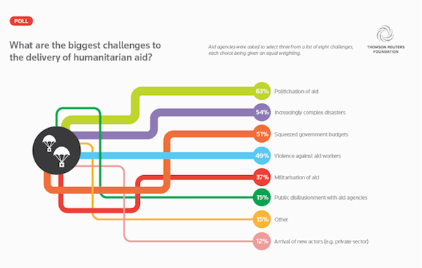
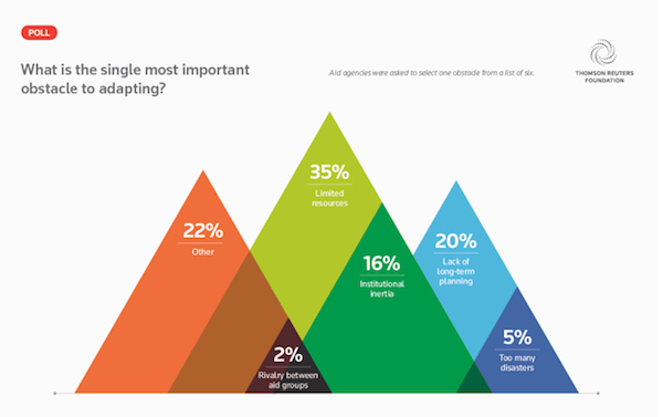
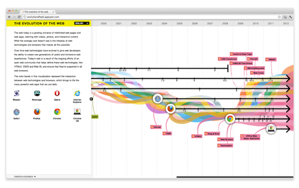
As students of illustration in college, Peraza and Zeltser's current work comes packaged with a strong visual sense. Nowhere is this clearer than in the information graphics they've created for GOOD Magazine and The New York Times--not to mention Thomson Reuters Foundation, ClimateWorks Foundation, Acumen Fund, Ford Foundation and Google. Hyperakt makes presenting statistics in an engaging way look simple, though the amount of work that goes into each one is painfully evident. Hit the jump now to see what we mean.
And after perusing the infographics down below, check out the rest of their work--and learn infographics 101 with 3rd Ward's classes in InDesign, Illustrator and Processing: an Introduction to Interactive Media. Oh right, we even offer a course in Branding. We know the next Peraza and Zeltser are reading this...


-- Perrin Drumm
 Email tagged
  Branding,
  Brooklyn,
  Core77,
  Design,
  GOOD Magazine,
  Hyperakt,
  Infographics,
  Kurt Anderson,
  Studio 360,
  Teach
Teach 
