The Unabashed NADA Art Fair NYC Trend: Color Blocking
 Share Article
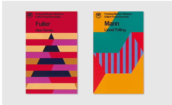
With each season comes a new set of trends, and in that respect, the art world is no different from any other market. Jerry Saltz--New York Mag's resident art critic--pointed out several in his recent, excellent piece on "How to Make It in the Art World." Amongst the listed trends: Trash, "Cindy Sherman-esque," neon words, candy-colored sculpture, video-game art, busted open canvases and art about the art market. Sure, there was a great deal of that on view at NADA NYC, but we'd like to add one more to the list, and that is: Color blocking.

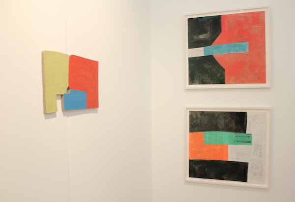
In general, the showing at NADA was unexpectedly colorful, but these bright, blocky compositions were clear standouts. In particular, Sadie Benning's untitled Gouache works on collaged newspaper drew us into Vogt Gallery's booth. Benning had several pieces on view alongside the super-flat figurative paintings by Mernet Larsen, who took traditional color blocking for a spin with Sit Ups Leg Lift, a depiction of two people stretching on exercise mats (as featured up above.)
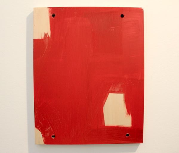
The showing from Galerie Christian Lethert continued the painterly take on the trend with Joe Fyfe's wood and acrylic Pursat. Fyfe's other work is similarly rough in technique but more involved and often incorporates a variety of media like fabric and large planks of wood. In fact, out of all his pieces, Pursat seems like the least representative of his work, but despite its extremely DIY appearance it attracted a flock of potential collectors.
The Rome gallery 1/9 unosunove was the most direct in their boldly color block-only booth, with three pieces by Dan Shaw-Town and a smattering of Jamie Shovlin's take on the famous Fontana Modern Masters (above), a series of pocket guides on writers, philosophers and thinkers. First published in the 70's, the guides became better known for their cover art than for their content. Art director John Constable was one of the first to use a sans-serif typeface on his abstract and op art compositions. The last book was published in 1995, but from 2003-2005 Shovlin reinterpreted the 48 covers "as a series of flawed paintings" with missing titles and running colors. While he was working on these he discovered 10 titles that, for whatever reason, were never published; amongst them Fuller by Allan Temko and Sherrington by Jonathan Miller.
In related news, consider checking out our Color Theory course, in which we prep you and your work for imminent NADA dominance (or the actualization of your individual, artist-oriented goals, which we feel is probably more vital.)
